Polity: Meet the middle
254 Responses
First ←Older Page 1 … 7 8 9 10 11 Newer→ Last
-
David Hood, in reply to
I don’t see how they can be using the two main parties (autocorrect correction) as reference points, as Labour is close to what they were provided with as the centre number.
-
BenWilson, in reply to
I mean a reference as to what direction is left and what is right. Not how far - that's what they judge for themselves.
What I'm saying is when they judge how left the Greens are, they evaluate how much like Labour the Greens are compared to how much like National. This is a theory on how people who don't even really care about the terms might judge this question.
-
Which can go some way to explaining why Labour and National are not equidistant from the center. I suggest that they mentally evaluate where they think the population center is, and then place the parties relative to that. I think they get that part wrong, that the center voter could very well think that the center is to the left of them because they feel more affinity to National, which they "know" to be right.
-
But having said that, those who don't care about the term at all aren't the only people. Perhaps the majority have some kind of definition in mind. I just don't think it's going to be the same definition across the board. It would, however, be interesting to try to model it to find what the features of that definition are.
-
Sacha, in reply to
defining the centre as the point between the parties
also not that smart in an MMP environment
-
Sacha, in reply to
It would, however, be interesting to try to model it to find what the features of that definition are.
verily
-
David Hood, in reply to
Mr Mark, I've put the R code for converting the SPSS election survey to a csv file here https://github.com/thoughtfulbloke/nzes/blob/master/makeCsvNZES2011.R
It uses R, which is free, but you need to know the R language to use- though in theory you can just put in these commands and get a csv file in the same folder as the SPSS file at the end. It will need an internet connect to download an extra library to read in the SPSS file.
-
People who party voted ACT like the National Party better than the party they voted for.
People who Don't Know who they voted for are most fond of New Zealand First.
NZ First voters are actually pretty comfortable with the Greens
The Party whose voters have the lowest opinion of other parties is National (3.075739), the party whose voters had the highest opinion of other parties was the Maori Party (4.388654)Seeing how much (scale of 0 to 10) people liked the party they voted for:
Act mean=7.107143 sd=2.9481857
Green mean= 8.360465 sd=1.7473865
Labour mean=8.133059 sd=1.9057797
Maori Party mean=8.080000 sd=2.1835160
NZ First mean=7.598086 sd=2.1797133
National mean=8.438565 sd=1.5798728
United Future mean=7.000000 sd=1.5191091I would like to graph this as a relationship diagram, but the relationships are not symetric. ACT voters love National, but National voters dislike ACT more than Labour. Which makes it tricky to graph.
-
BenWilson, in reply to
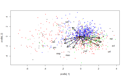
Can you plot the variable coefficient positions too? All 9 of them?
Worked out how to do this. Still learning how to interpret the outcome though. Note that I had to scale up the arrows and placement of the texts, because otherwise they'd have been lost in a tight cluster in the middle of the graph. The arrows are 5 times longer than they should be, which is where the texts should be found. They'd be unreadable.
-
So far as I understand, the first principal component is putting similar weight on lab and grn, and also nat and act, but in the opposite direction. It places very little weight on nzf. This is quite like the left-right axis. The second component, in the up-down direction places positive weight on self, and negative on everything else, most strongly for the smaller parties. It hardly puts any weigh on nat.
I think this suggests that how people rated themselves has little bearing on their choice between Labour and National, more so for the smaller parties, particularly NZF.
But I'm inexperienced at interpreting these at the moment so don't take my word for it.
-
BenWilson, in reply to
I think this suggests that how people rated themselves has little bearing on their choice between Labour and National, more so for the smaller parties, particularly NZF.
I change the wording of that entirely. How people rated* themselves has little bearing on how they rated* Labour and National, but does have some bearing on how they rated* NZF and the other smaller parties.
*rated on the left to right scale.
-
Interesting work, thanks, though I get lost in some of the stats detail.
How about modelling potential MMP coalitions as single entities? Be interesting to see where the two major left/right ones overlap rather than just use Nat and Lab as proxies.
-
BenWilson, in reply to
How about modelling potential MMP coalitions as single entities?
There's a heck of a lot of them. The number of potential coalitions is 2^(number of parties), roughly (every party is either in or out of the coalition). For the top 8 parties, that's 256 potentials. But of the probable ones the list is much shorter. Can you say what groupings you're most interested in? Maybe narrow down the "swinging" parties. If that list is only {UF, NZF, Maori} then we've got it down to 8. Do you consider the Greens to be potential swingers? If so, it doubles the number of options. Could be interesting, though.
What kind of analysis are you interested in? For the positioning, I could add the totals for each score for each party in the coalition to make a coalition left-right distribution. So adding those who gave National a 7 to those who gave ACT a 7 and those who gave UF a 7 and those who gave Maori a 7 - do that for each number and get a master distribution for the right-coalition? Try that with a few combos? That sort of thing?
-
BenWilson, in reply to
Interesting work, thanks, though I get lost in some of the stats detail.
Me too. Part of the point of doing this on here is to get an idea what a "lay" audience can understand. By "lay" I'm meaning a clever and interested audience, who are not themselves statistics specialists, but could well have higher than average ability to follow it. But also people who aren't even any good at stats - it's interesting to hear which visuals they can get anything out of.
Also, the masters can help me debug my own misunderstandings. I've got to be a bit bulletproof to the possibility of being shamed out massively by getting something completely wrong. I tend to think that when that happens, it's actually a really good teachable moment for everyone participating. Not being someone with their reputation on the line, I think I can take being the useful idiot on the chin.
You have to risk being wrong to get better at being right (or at least less wrong). As a group, you only need some people to do that.
-
Cheers, David and Ben.
Some very interesting (albeit necessarily tentative) conclusions.
-
David Hood, in reply to
getting something completely wrong
I fully expect, that if I argue on the internet about things that I have little specialist knowledge (for example, what I know about both political science and housing markets is only that of a broadly read member of the general public) I might miss something fairly fundamental and make a complete botch of it. But the nice things about a fully documented analysis of data from start to finish is that if you do botch things early on, you just go back to the code of the early stages, change it, and rerun, and in a second or two you have inorporated the corrections into the analysis. I would much rather do something, and be right eventually, than try to be right from the very start and never achieve anything.
-
BenWilson, in reply to
I would much rather do something, and be right eventually, than try to be right from the very start and never achieve anything
Yup, at the very least, it's interesting to ourselves.
if you do botch things early on, you just go back to the code of the early stages, change it, and rerun, and in a second or two you have inorporated the corrections into the analysis
Totally. I was able to very quickly check if my labels were messed up the way you warned of. I'm using the "foreign" library in R so I don't think my SPSS read function was the same as yours. It failed on some things, but they didn't seem significant - so far as I could tell, R just can't read some of the features of SPSS files using that library, but they seem to be SPSS icing, and not compromising of the data frame that I constructed. But if they had been messed up, I could have produced all my graphs again after fixing what was wrong, in a few minutes.
-
Just putting some numbers in. Going with the 3101 entries, and going with Robs original Left Right distinction (which I don’t think is very meaningful but am going along with for the point of view of doing something clever with the numbers.
Of the 3101 entries in NZES
1587 voted in 2008 and 2011 for National and Labour (so might actually be on the labnat spectrum which Rob is working with, I would argue other parties form their own axes (I say “might” because if they have only voted for one party you don’t know that is their axis of movement, but they are one the line)
The number drops to 1114 when you include only those that can actually put themselves, Labour, and National on a Left-Right axis (as you can’t actually measure things otherwise)
You then need to take out the 128 that place Labour equal to or to the right of National, as then aren’t moving along the same left-right axis as everyone else. Leaving 986.
Now, as to the 33%/33%/33% median voter, If we call someone who places themselves equal to or to the left of labor as left, equal to or to the right of National as right, and in-between the (contested) middle, we get a proportion of voters:
Left = 22.7%
Middle = 35.3%
Right = 42.0%Which may seem a bit grim until you realise that this is just the LabNat axis and if we repeat the process with the Greens and National we get 762 that have voted only Greens or National and a spread of
Green = 11.8 %
Teal = 36.7%
Blue = 51.4%As an observation, this is probably why “the threat of the Greens” is used now and then by National, there are more “will never be green” votes on the blue-green axis so it gives a better group to demonise. {Edit it also reflects that left-right is a bad primary classification for Green support}
But because National has no real allies (parties where the people voting like National better than the party they are voting for are pretty clearly voting for National in a strategic way) it means that they are potentially vulnerable along every axis.
More to come, building on this, focusing specifically on the left-right axis Rob was posting about (which I don’t like, I say again).
-
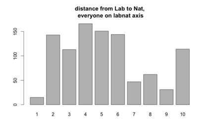
So one problem with looking for the median voter on the labnat axis is that the NZES respondents (at least the small subset we can talk about with respect to this question) is people have placed Labour and National different distances apart (see graph), so where hey are self reported as in relation to that will mean different things (calling yourself a 7 when you call Labour a 5 and National a 10 means something different to when you call yourself a 7 and call Labour a 0 and National a 7. This can be compensated for by scaling everyones responses to a range from Labour at 0 and National at 30240 with the self reporting figure scaled to match.
Clearly most people go "Labour could be more left wing, National could be more right wing, there is about a 4 point difference" but some people go "Labour is 0 and National is 10"
-
BenWilson, in reply to
More to come, building on this, focusing specifically on the left-right axis Rob was posting about (which I don’t like, I say again).
Keep it up, I'm reading it. I'm going to leave off these specific variables now*, since you're going hard on them. I'm going to take a different tack - modelling the respondents positions based on their opinions on issues that don't pertain to left-right-ness. In other words, instead of looking at where they place themselves in this contested model, it's just where they place themselves on the general opinion space. This will take quite some time because there are a LOT of variables.
*Well I will probably answer specific questions if anyone has them, and you don't get there first.
-
BenWilson, in reply to
Clearly most people go “Labour could be more left wing, National could be more right wing, there is about a 4 point difference” but some people go “Labour is 0 and National is 10”
Is 4 the median there? I'd have thought it was 5, despite not being the mode. I say this because 4 looks like it's got a lot more to the right of it than the left.
-
David Hood, in reply to
That was just by was of example "around 4" I didn't work it out with this particular group. I certainly would expect environmental questions would make more sense explaining the green vote, but haven't checked anything but the self reported location.
-
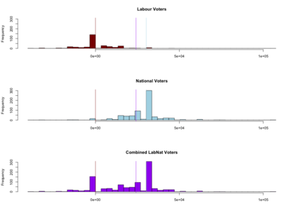
So if you pretend no-one but National and Labour were running in the 2011 election, and pretend nothing but how the voters placed the parties left to right against where they placed themselves matters, and scale all the voters distances between the parties so they match, this is how it looks.
The red vertical line is the position of Labour, so anyone to the left is at least as left as Labour. The blue is National, the purple is the median voter in this highly artificial model.
Personally I think this is a silly model to use. Even doing everything to make it look like a right left case, I still read it as the influence of National was extending further than the influence of Labour, there are more people left of Labour voting National than there are right of National voting Labour.
showing my working in R
-
BenWilson, in reply to
Even doing everything to make it look like a right left case, I still read it as the influence of National was extending further than the influence of Labour, there are more people left of Labour voting National than there are right of National voting Labour.
Why does that seem so silly? National got more votes period by a substantial margin, so I'd expect their reach to be further.
-
As I understand it the left right metaphor is one of strategic positioning (hence the move to to middle arguments) rather than a multidimensional strength of signal metaphor.
I spent entirely too long this evening looking up what colour election orange was. I am, for the record, now using #f89828 for graphs about the election.


Post your response…
This topic is closed.