Up Front: Stand for... Something
210 Responses
First ←Older Page 1 … 5 6 7 8 9 Newer→ Last
-
Deborah, in reply to
Steven, can we spread this image far and wide? Both my husband and my eldest daughter burst out laughing when they saw it.
Or am I totally out-of-touch and it's already spreading like mad on Twitter?
-
chris, in reply to
That’s design is hot, is that a fern in the vulture’s mouth or a fern in the girl’s hair! Magic. Despite that wikipedia vexillology fob off ;)
-
Deborah, in reply to
It's a pony tail, especially for Mr Key.
-
chris, in reply to
Oh I see!!!! =)
-
The flag consideration panel published this excellent video from the Designers Institute, explaining the principles of flag design, a couple of months ago.
And then apparently ignored nearly all those principles. This process is off the rails.
-
Deborah, in reply to
I absolutely assumed that it was something your ever fertile mind had come up with.
I think I might just start spreading it on my networks anyway….
-
chris, in reply to
-
A great column by illustrator Toby Morris on what could have been.
-
Russell Brown, in reply to
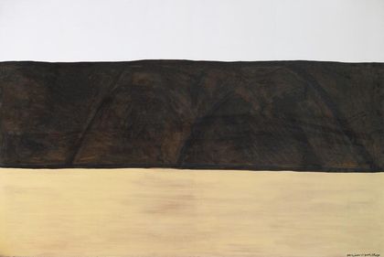
North Otago landscape no 2 by Colin McCahon
My god I love that. Not for a flag, just for itself.
-
chris, in reply to
He’s one of my heroes, I was turned onto him by Jonathan Mane-Wheoki. As a flag it would probably only work with the beige brigade but it came to mind watching the principles of flag design video. There’s a bit about it, including something of an explanation by McCahon, here.
-
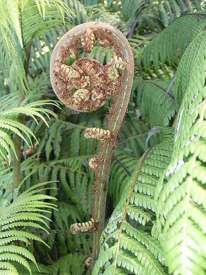
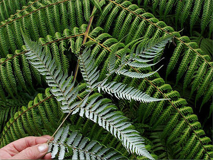
Ponga rocks!!
Three full fern fronds and a baby frond unfurling
or four Cyathea dealbata leaves.Though that Trade & Enterprise swipe is a tad botanically inaccurate, and looks a bit chunky.
But what better symbol for a nation being steadily taken over by money-traders and body-snatchers, than a plant that reproduces by spore…
…and let’s not forget that those groovy fern koru are also known as ‘fiddleheads’ something to appeal to English and Joyce…
- much ado about nothing with fractal to show for it?With fronds like this who needs enemas?
-
Ian Dalziel, in reply to
-
Ian Dalziel, in reply to
-
Ian Dalziel, in reply to
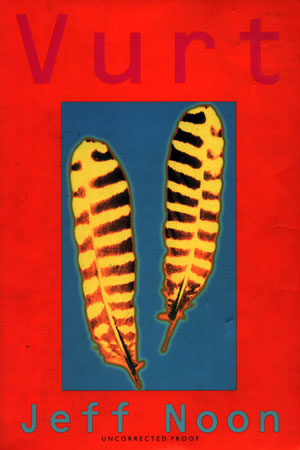
he's so vane...
The white feather has a very significant symbolic meaning, that has nothing to do with playing games.
Not Jeff Noon's 'Yellow Feather' from Vurt then?
I see the NZ white feather is about pacifism
In the 1870s, the Māori prophet of passive resistance Te Whiti o Rongomai promoted the wearing of white feathers by his followers at Parihaka.
Not the message John Key is trying to unconsciously send, methinks...
-
Bart Janssen, in reply to
This process is off the rails.
Last step in the process was National party caucus making the decision.
Hence we have a crappy business logo in National party colours.
Precisely what was intended in the first place.
-
-
-
Joe Wylie, in reply to
North Otago landscape no 2 by Colin McCahon
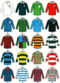
I am put in mind of a section of rugby jersey...
Noooooooooooooo......You might recall the Carl Barks tale where Donald Duck and his nephews accompany Uncle Scrooge to Scotland in search of the McDuck tartan. They find it in the studio of a "modern artist" who blows up and copies details of the fabric to produce Mondrian-like paintings. Naturally he gets exposed as a fraud.
-
Ian Dalziel, in reply to
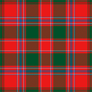
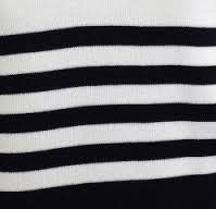
the McDuck tartan
of course ducks were very early web adopters...
...and here is the Dalziel tartan (above)
-
Katharine Moody, in reply to
This process is off the rails.
And it is recognised that the black and white fern logo is trademarked;
Former Black Caps captain Stephen Fleming chose the black and white stylised fern as his favourite. That design includes a fern which is trademarked and used as a logo by Government groups.
Change the Flag spokesman Lewis Holden said the use of it as a logo might damage its chances although the maple leaf design on Canada's flag was a biscuit tin logo.
http://www.nzherald.co.nz/nz/news/article.cfm?c_id=1&objectid=11506413
What? It would be good if the panel explained the implication of that. Why pick one design that is somehow disadvantaged over others?
-
-
Ian Dalziel, in reply to
-
Kumara Republic, in reply to
The flag consideration panel published this excellent video from the Designers Institute, explaining the principles of flag design, a couple of months ago.
And then apparently ignored nearly all those principles. This process is off the rails.
It's ringing as hollow as the decision made over the Wellywood sign.
-
Gregor Macaulay knows his flags. He's the editor of the NZ Heraldry Society's magazine and he designed the Otago flag in 2004. He dismisses all four of the proposed options as ''underwhelming'' and ''more complicated than is necessary''.
Dr Bryce Edwards is also quoted in the ODT story.
"The flags aren't likely to be terribly controversial ... but by the same token, they're not particularly exciting or groundbreaking,'' he said.
''They're more likely to be controversial because they're a bit bland.''
Dr Edwards said the blandness of the flags was a problem, because the flag referendum process was, by nature, a nationalistic one.
If no one was excited about it, it would fall flat, he said.
Is anyone at all excited by the four designs, apart from John Key and the flag design panel?
-
There's a good piece in the Herald from Grant McLachlan. He's a former Parliamentary researcher and surprisingly, given the context, a National Party campaign director. The first para tells you exactly where he's coming from.
New Zealand Idol should never have been used as a template for the Flag Consideration Panel.
He goes on to list numerous conflicts of interest in Key's flag debacle, including a few I wasn't previously aware of. What a corrupt, expensive, badly-handled vanity project this has turned out to be.






Post your response…
This topic is closed.